

Before getting started, let’s ask, Why floating label? Because often we don’t prefer a label resting on the top of an input field all the time as it looks very elementary and occupies a bit of space. We rather prefer using a placeholder attribute, but when we start typing in the input, the placeholder disappears, making it painful and frustrating for us to confirm if we entered the appropriate value in the input field.
Keeping the label makes it simpler for users to understand the purpose of the form elements. Although the purpose of each element may be obvious for sighted users, this is often not the case for users who rely on screen readers.
But using labels can sometimes be boring, which is the reason most websites use floating labels. You might have seen the inputs wherever when you click or start typing, the placeholder flies away from it, that flying placeholder is the floating label. This looks very cool, and compact and gives the user a better experience. Today we are going to create our own floating label with merely HTML and CSS.
Table of Contents
Making a floating label
So the trick behind creating a floating label is we need the label as the immediate sibling of the input, in plain words it should be ordered directly below the input. By doing so we can handle the label according to the changes happening in the input.
Initially, a hidden label will overlap the placeholder. Whenever the user starts typing and the placeholder disappears, the label will fade in and simultaneously move upwards to certain pixels. Sounds confusing? Well then let’s begin to bring it into action.
HTML markup
First of all, we need to create the HTML, where we are going to have the following:
<div class="input-text"> – The parent div.
<input/>– Form input, where the user is going to enter their value.<label>– Floating label, which will float to the top of the input, when the placeholder is not visible.
<div class="input-text">
    <input type="email" placeholder="Enter Email" required>
    <label for=""> Enter Email</label>
</div>
Styling the floating label
Step 1
Let’s begin with styling and positioning the label as absolute and aligning it to the placeholder ( Figure-1 ).
.input-text{
   position: relative;
}
.input-text > label{
   position: absolute;
   left: 0;
   top: 10px;
   color: #9e9e9e;
   font-size: 14px;
   transition: 0.25s all ease-in-out;
}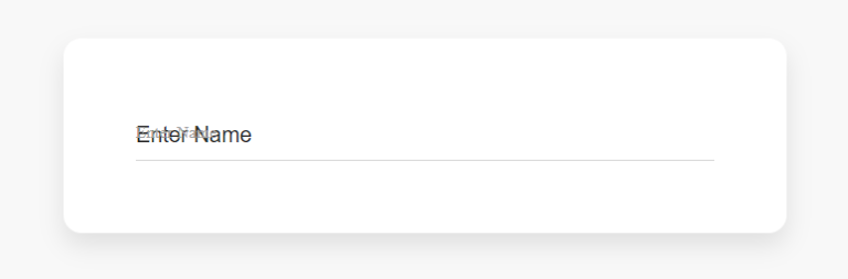
Now we need to make the label disappear so only the placeholder can be seen.
.input-text{
   position: relative;
}
.input-text > label{
   position: absolute;
   left: 0;
   top: 10px;
   color: #9e9e9e;
   font-size: 14px;
   transition: 0.25s all ease-in-out;
   opacity: 0;
   visibility: hidden;
}
Step 2
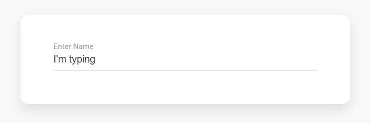
Now we have settled our label so all that’s left is to float and fade in the label when we start typing ( Figure-2 ). To do so we will be combining :not() and:placeholder-shown CSS selectors.
The :not() selector selects every element that is NOT the specified element/selector. While :placeholder-shown pseudo-class selects an input element that is showing the placeholder text. So when the input is not showing the placeholder text, we will float its adjacent label.
.input-text{
   position: relative;
}
.input-text > label{
   position: absolute;
   left: 0;
   top: 10px;
   color: #9e9e9e;
   font-size: 14px;
   transition: 0.25s all ease-in-out;
   opacity: 0;
   visibility: hidden;
}
.input-text > input:not(:placeholder-shown) + label{
   top: -12px;
   opacity: 1;
   visibility: visible;
}
Hooray! So we have finally created our floating label without using any javascript. You can see a live example.
Conclusion
I would love to see how you’d implement this in your next project. Come back here and tell us about the before-and-after. I bet you’ll have something to say! You can also check out how you can validate the form using CSS while using a floating label.
If you found this post helpful, I would be very grateful if you would help it to spread by emailing it to a friend or sharing it on Twitter or Facebook. Thank you!